
Black and White All Over : Desolate Painting
MAGAZINE SPREADS
GOAL
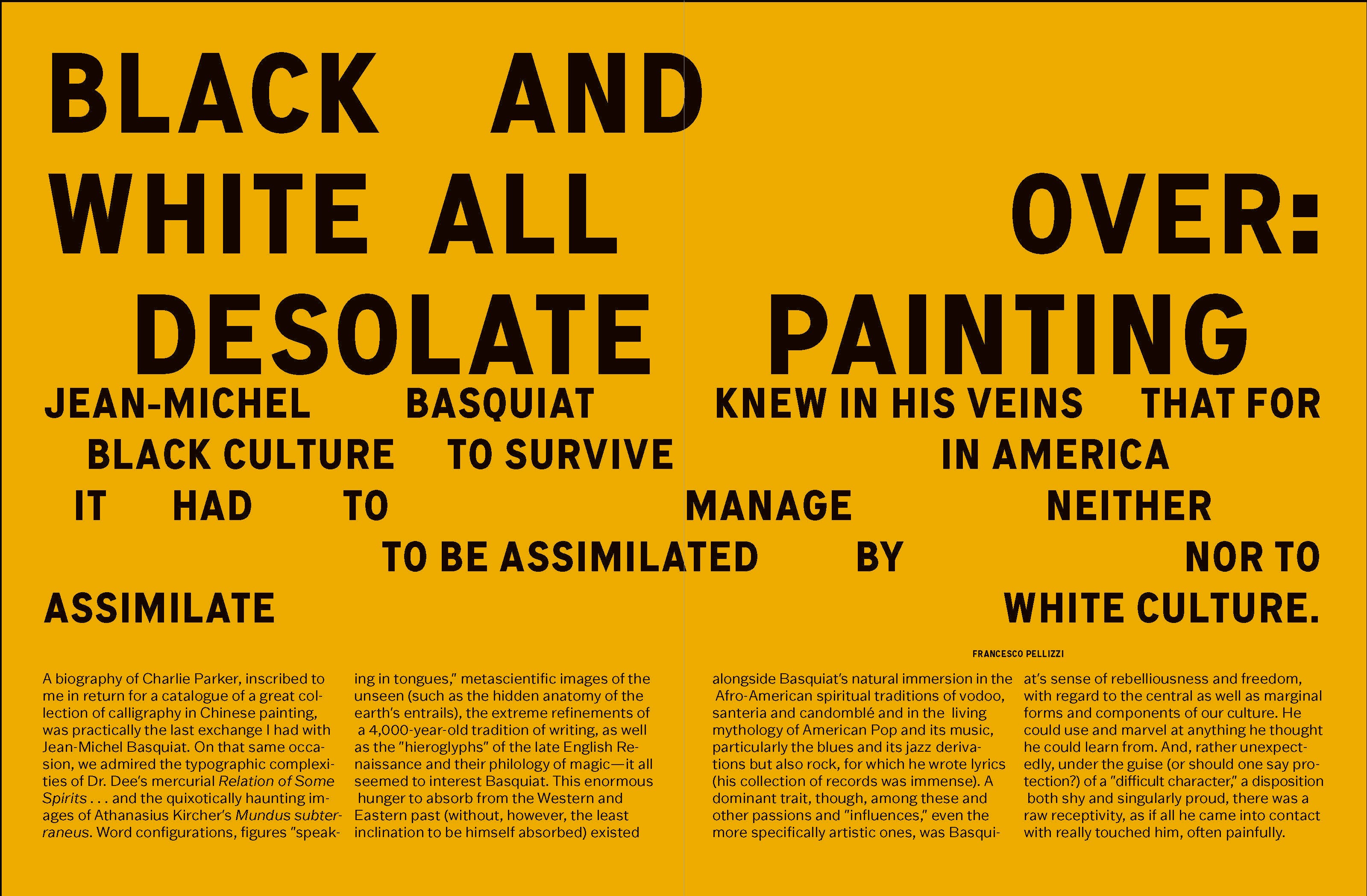
Create a magazine spread for an article about Jean Paul Basquiat, only using type and colour, no shapes or images.
RESEARCH
To start this project, researched Basquiat's works and his life. I also looked at a bunch of magazine spreads to better understand the layouts and techniques used. From there, I was able to get a better idea of the direction I was going to take.
DESIGN STRATEGY
I decided to create a strict structure to begin with, then played within its confines to create a bold, sporadic feel. Taking inspiration from the way Basquiat mixes texture, image, and text within his many works.


Research and Ideation


KEY WORDS: abstraction, structure, expressionism, pop art, texture
APPROACH: create structure, hierarchy, contrast, and interest using only type and colour
CLEAN BOLD TYPE: Punchy type to fit the boldness of Basquiat's work and draw in the viewer. Making a point to keep the type clean and structured with a tight right rag and clear, bold headings. The body type would be used throughout the whole magazine, so it is important for it to be adaptable.
EXTRAPOLATION: For this piece, I wanted to make a point of extrapolating from Basquiat’s work rather than emulating it. When creating for an artist, it can be difficult not to latch onto their style; however, I found it important to pay tribute to their work rather than recreating it.
