

GOAL
Create a visual language for a three-day cultural festival. Developing a new identity for the Mariposa Folk Festival and applying it across all of the festival content.
RESEARCH
To start this project, I did a deep dive into the history of the Mariposa Folk Festival through a research report.
DESIGN STRATEGY
I decided to emphasize the festival’s sustainability and natural focus, as well as its eclectic, crafty vibe.


AUDIENCE: the festival aims to be an inclusive and safe space for all ages, with a conscientious effort to cater to families.
KEY WORDS: earthy, connection, free-spirited, quirky, mindful, welcoming, crafty, vibrant, eclectic, sustainable.
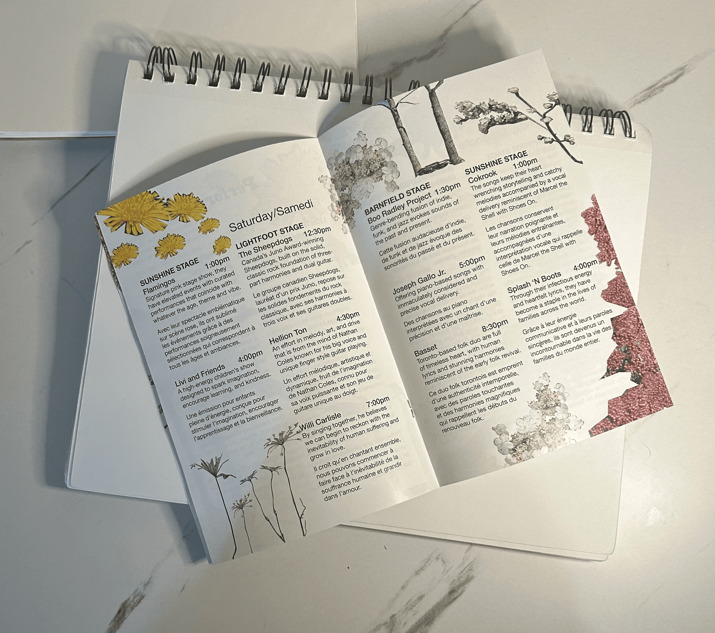
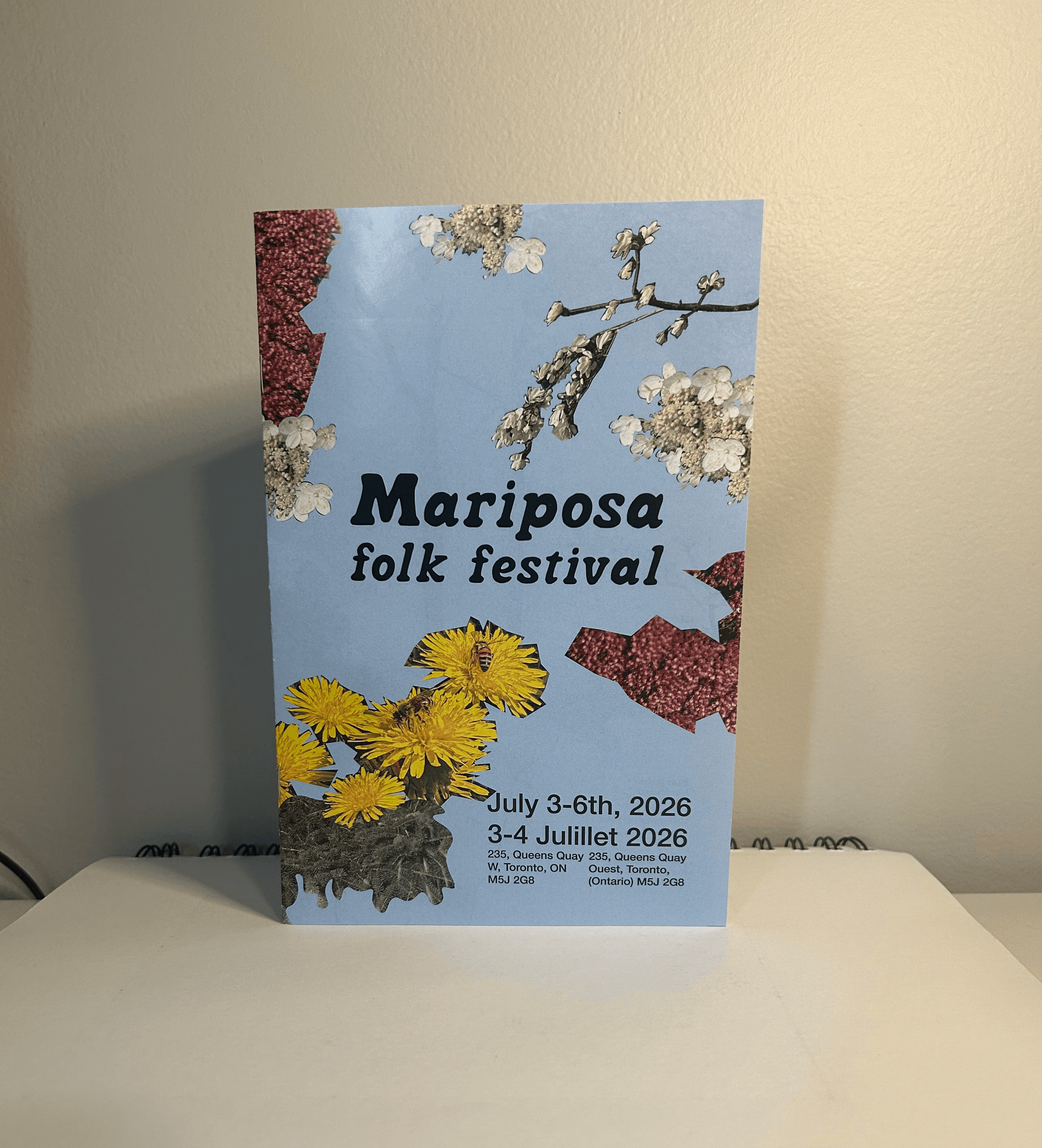
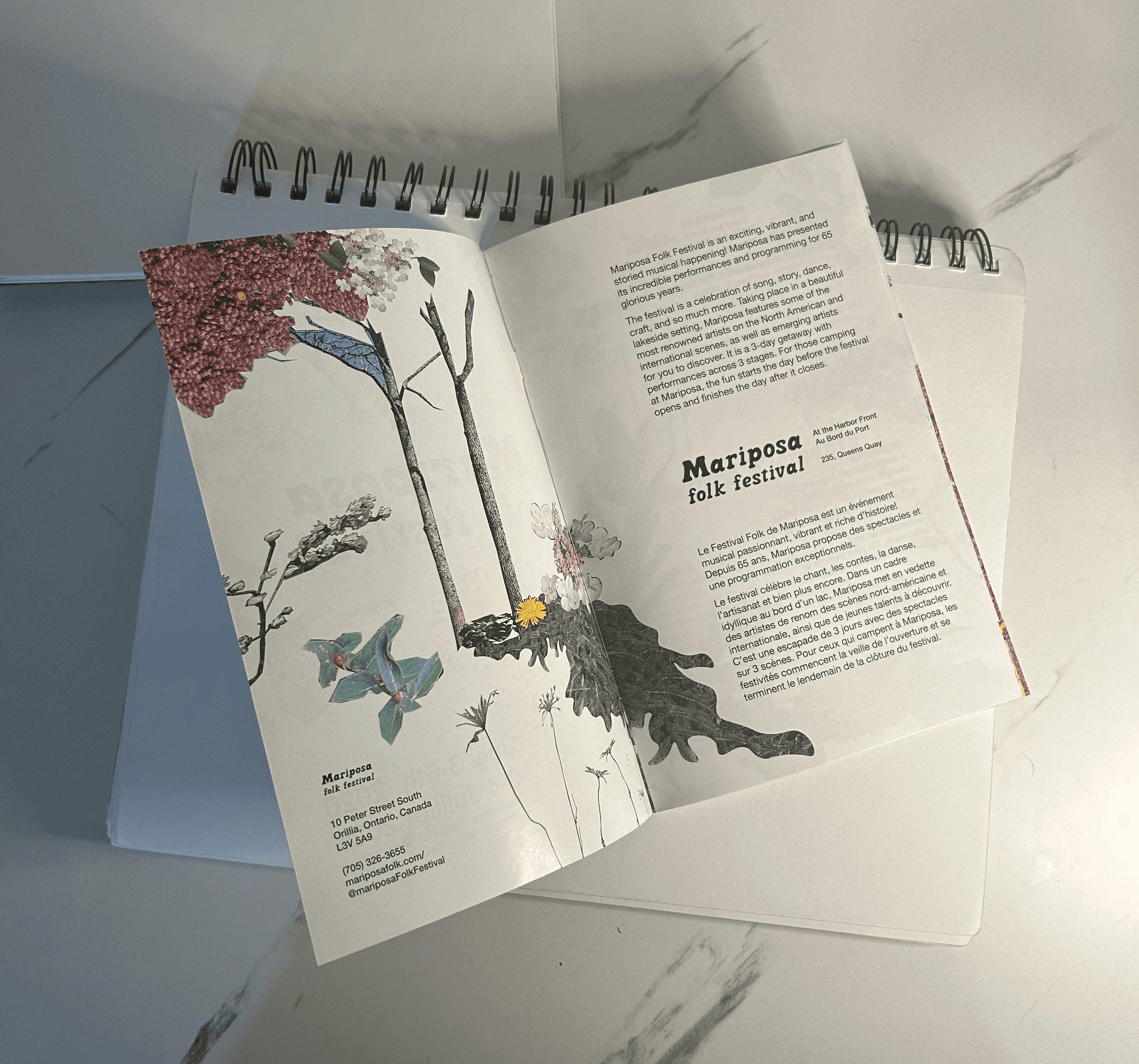
TYPE: soft, rounded feel to fit the comforting feel of the festival and complement the natural elements in the design system.
APPROACH: I used a collage technique, bringing together different plants from Ontario to emphasize the natural, local theme of the festival. I took all the photos myself to carefully curate a mix of soft tones and vibrant pops of colour.


